Protect Texas Together is a mobile app created by UT that me and my team improved, as a precautionary guide for COVID to those returning to campus this fall. Ultimately, this app is a helpful tools regarding COVID resources available on campus. It also allows UT utilize user information to see whether a higher level of control needs to be enacted on campus to make sure that students, staff, and faculty are safe.
Collaborators: Sheryl Long, Amulya Kandikonda, & Colby Holloman
Heuristic Evaluation
In order to help us develop a redesign of the ProtectTexasTogether, we found issues in the app and communicated what heuristic or principle it violates.
Findings & Issues #1
When pulling up the HomeScreen of the application, statistics are a feature that is not always readily available as seen in the first screenshot. This takes away a feature from the user to readily use and doesn’t indicate anything else other than “unavailability” thus violating the “Visibility of System Status” Heuristic by Jakob Nielsen.
Findings & Issues #2
Our second main issue is that it is difficult to achieve user tasks and goal which violates the Heuristic of “Consistency and Standards” and “User Control and Freedom” As you can see in this screenshot, when taking the symptom survey, the “next” arrows are extremely close to the answer choices making it easy to click the wrong button. If you accidentally choose the wrong answer, there is no “back” button to return to the previous question.
Findings & Issues #3
Our last main issue is that the overall User Interface of the app is cluttered and which in turn can make a user overwhelmed. It’s important to keep the content and visual design focused on the essentials/important features. In order order to support primary goals for the user.

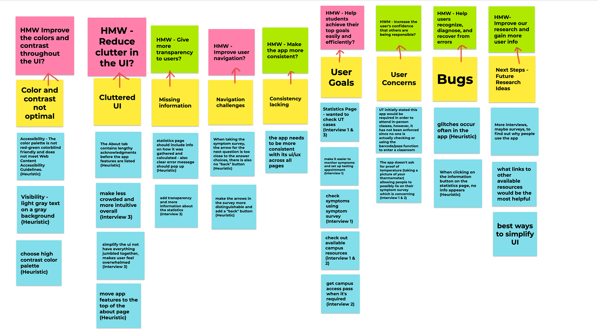
Affinity Diagraming
Once my team members conducted user research interviews with people who are representative of our target users, we were able to understand more about our users and their experiences as they try to achieve their goals and complete the tasks we identified for the heuristic evaluation.
In order to organize what we learned we created, we made an affinity diagram with extracted insights and "how might we's". In order to develop next steps for wire framing.
We eventually decided we wanted to focus on
1. How might we reduce clutter in the UI?
2. How might we improve User Navigation?
3. How might we help students achieve their goals easily and efficiently?
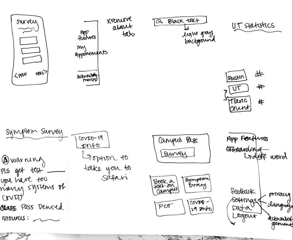
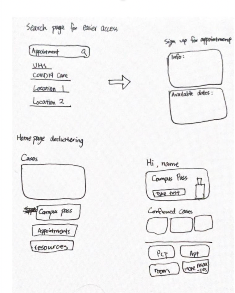
Low-Fidelity Wireframes
We decided to focus on the home page for a couple reasons.
1. It is the first page that every user opens the app to, so it’s extremely important that the user feels comfortable with this page.
2. It holds all the main functions of the app - the user uses the home page to navigate to any function that they are looking for.
3. On the App Store, the home page is also where the most reported glitches are, so if we can improve the home page, user satisfaction will increase.
4. As a team, this is also where we found the most problems regarding heuristics that were extremely eye-catching and distracting.

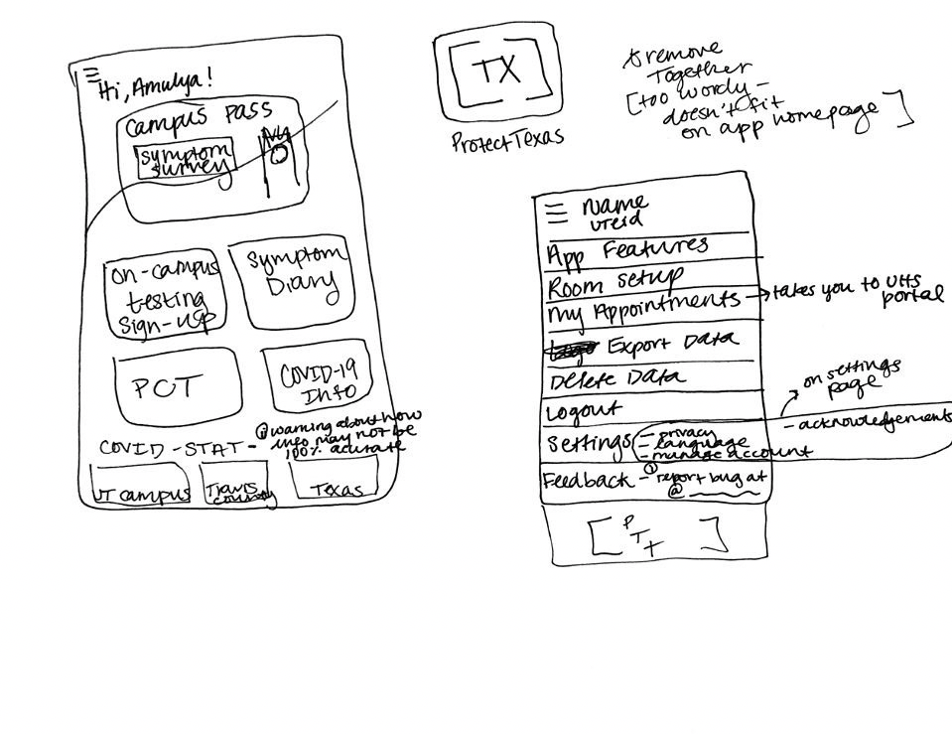
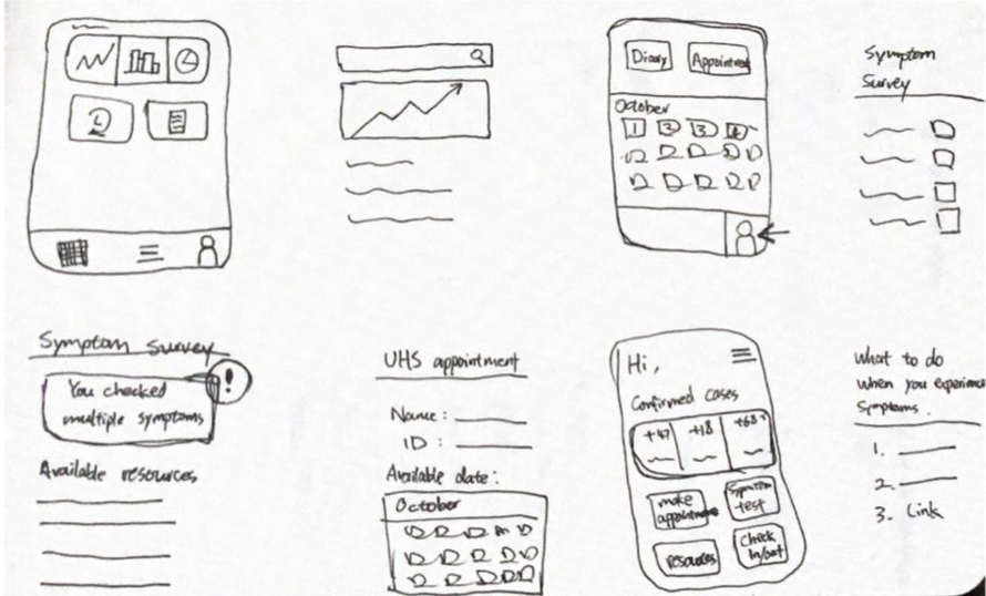

Wire Frames and User Feedback
From here, we developed wireframes in Balsamic and ended up with my final redesign of the Home Screen and setting up a UHS appointment. Once we each had our wireframes done, I placed them together to be a clickable prototype.
As you can see, we still kept features of the app but we simplified the layout and appearance of it. We also moved Covid Statistics to the top of the app since it is a popular feature on the app according to our initial interviews. A navigation bar was added on the bottom of the app so it would be easier to access the home page, your personal profile page, search, and check your calendar for appointments. We also wanted to present the question “What do you need” to make it more user friendly rather than having it say symptoms and test as the title.

Once my teammates conducted a second round of interviews based off of our prototype, we learned.
1. That most users are interested in COVID statistics and that it is much easier to access compared to the original design, since we placed more emphasis on this popular feature, making it easier to access.
2. Our unique Hotspot feature in our redesign, helps users avoid crowded areas and is beneficial for local users (our target audience).
3. The Appointment feature allows users to complete a series of related tasks within one application. It is also a more simplified and easier process.
The full interactive prototype can be tested here.